


Special Issue: A Polemic Against the 2024 Affordable Art Fair NYC

A few days ago, I attended New York’s Affordable Art Fair for the first time … and this will most likely be my last visit. Let me be clear in stating that I am not writing this article from the standpoint of an Art Critic, but from that of an Art Historian. Without getting into the semantics of the differences between each type of perspective, I have no interest in writing criticism (I.e. taste-making), but am passionately devoted to writing Art History (I.e. education/making Arts education accessible to everyone). The urge to attend the Affordable Art Fair occurred earlier in the month when I received a complementary ticket from a gallery that I frequent which allowed me access to the private viewing on the evening of Wednesday, September 25th. Considering I never previously attended, my curiosity was piqued. Even more than that, I wanted to see how the works on view and artists represented were reflective of new trends, themes, styles, and ideas permeating today’s Contemporary Art scene - just how the art of this fair could be a microcosm for the future of Contemporary Art, the Art History of tomorrow. Unfortunately, the entire event was a massive disappointment riddled with issues that require redress.
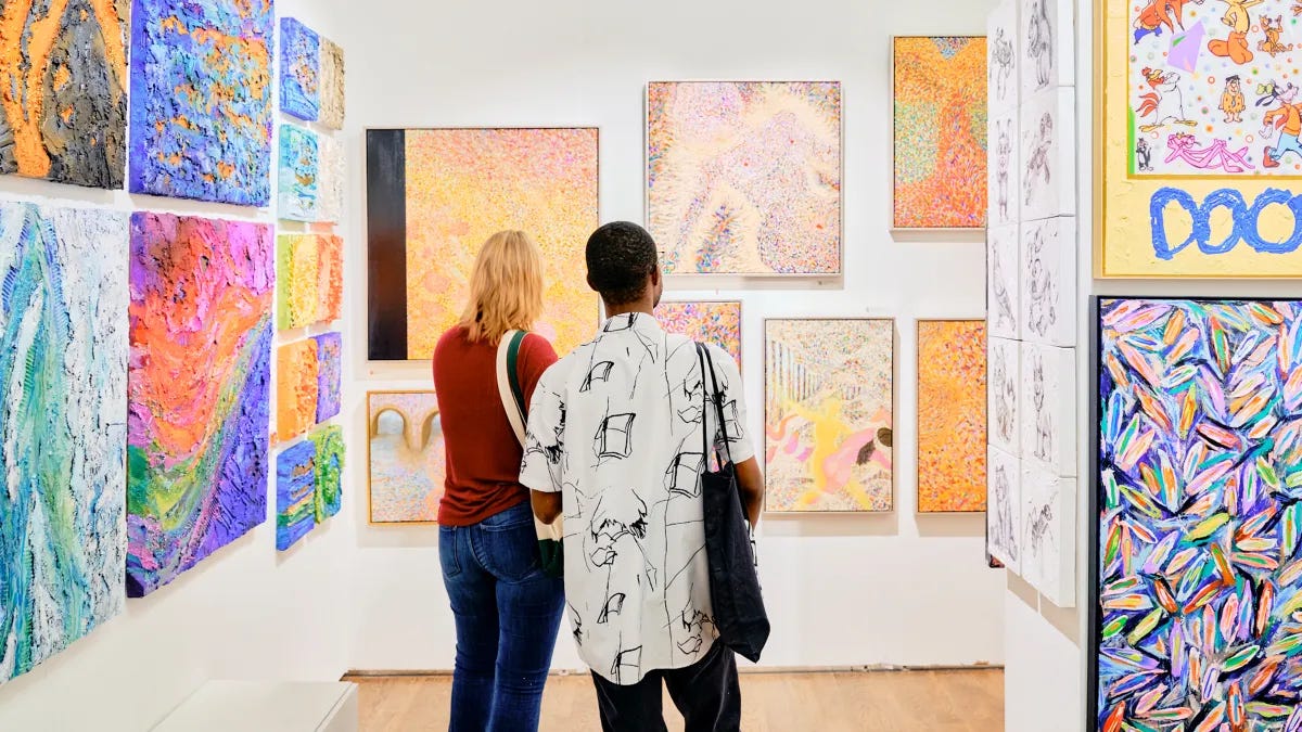
Perhaps it would be best to start off with the topic of affordability. If you are someone who is keen to purchase an artwork but are not of the tax bracket that can casually spend a few million at an auction, then I suppose this is the event for you … that is, if you are willing to still shell out a few thousand. According to the website, all of the works in the Affordable Art Fair are priced between $100 and $12,000. Any work that sells for $500 or less is actually quite reasonable when taking into account the amount of money to be allocated for the gallery, its staff, the artist, a potential non-profit/charitable link, and the Affordable Art Fair itself. However, these - and especially the works purportedly selling for $100 - were few and far between. Almost everything I encountered across the narrow, maze-like two floors of gallery booths were in the thousands of dollars range. I am not frugal by nature, but I do think it is ridiculous to sell an abstract or figurative acrylic painting on canvas whose dimensions are about 12 x 14in. for $5000. That is not a ridiculous price if it were outside of the context of an “Affordable” Art Fair. Also, the ticket prices for the event are staggering: $40.91 for General Admission, $52.28 for stroller hours (family events), and $97.80 for the all-access pass according to the website Eventbrite. For these prices (especially General Admission), who is the target audience for the Affordable Art Fair? Art is subjective and, so too, is money as I have come to learn.
I am afraid I need to bring up a rather uncomfortable term that has negative connotations in the Art World: Zombie Formalism. The entire event absolutely reeked of Zombie Formalism. If you are not familiar with this term, it is still a relatively new idea that was conceived by the artist & art critic Walter Robinson in 2014. Quite frankly, it really needs to enter the public discourse after the farce of an event the Affordable Art Fair demonstrated. Zombie Formalism is used to describe artists who create pieces that deliberately adopt stylistic elements from previous well-known artists simply because it will be a surefire way to sell, sell, sell. This is the complete opposite of paying homage to another artist or drawing inspiration from another. What Zombie Formalism reveals is that there are artists who will create works that bear uncanny resemblances to that of a more famous artist, but done in a somewhat different manner to pass off as an “original” and not a direct copy (and thereby falling under the false aegis of “inspiration”). The artist and writer Chris Wiley once commented on a work that looked like “a Barnett Newman [painting] out in the rain” or Robinson remarking that these Zombie Formalists “bring back to life the discarded aesthetics” of renowned figures like Jackson Pollock, Franz Kline, and Morris Louis. It should also be acknowledged that these activities are often fomented by dealers and commercial galleries (I will go into more detail later on the differences between commercial galleries and public galleries).

And my god, I was speechless over how many works I saw (mainly abstract) that were visual knock-offs of original pieces by Mark Rothko, Helen Frankenthaler, Kenneth Noland, David Hockney, Jasper Johns, and many other artists of the 20th Century. Not long into the event, I encountered a series of works that looked exactly like the famous target motif paintings of the Color Field painter Kenneth Noland (American, 1924 - 2010) or his contemporary Jasper Johns (American, b. 1930). I met the artist who created these works (pictured alongside an image I brought in of a Noland painting). I was dying to know if the work was inspired by Noland, but the artist replied “Ugh, I do not know who that is.” Seriously? Oh, how I wanted to call out the ludicrousness over this flagrant attempt at passing off these sham pieces as originals with no stylistic predecessor. Of course, I wanted to maintain my cordiality and professionalism, so I replied with a “Oh, very good” and walked off as there was really nothing I could comment on. It was probably my worst interaction with an artist, and for good reason. I was so perturbed by this that I did not even get his name, which is probably for the better. Mind you, I am not personally a die-hard Noland fan, but I recognize the importance he wielded as one of the leading abstract painters in 1950s and 1960s America as his unique style, though commonly associated with Color Field, is a bridge into Minimalism and Geometric Abstraction. I included a few additional images that provide further comparisons between the artworks shown at the Affordable Art Fair and the originals from which they are derived (the last one is not from the fair, but is a potent example as I realized I did not photograph one of the works that imitated David Hockney).


As I stated in a very brief post on my Instagram account (@ artstigator) the day after the event, Zombie Formalism is where creativity dies, and selling out begins.
The theme of appropriation art did come up in one of the booths that I visited. For the last few decades, appropriation art has sparked insightful discussions on the usage of images and materials from pre-existing works that have been applied in a renewed context, to which Richard Prince and Sherrie Levine have demonstrated time and again. However, the - and please excuse my language as I use this purely for emphasis - piss-poor attempt that I witnessed at this next venue signified how old hat this trope has become in Contemporary Art when done by someone working in the vein of the Zombie Formalists.


I am not someone who gets easily offended, but in this particular case, I was completely livid. Though not quite the same as Zombie Formalism, this next issue makes for a compelling jumping off point. I was drawn into this booth as I saw a Basquiat - but not really a Basquiat as it was a copy by someone else. French artist Joris Ghilini produces acrylic on wood pieces that are purposefully imitative of works by known artists like Jean Michel-Basquiat and Pablo Picasso, except these are portrayed in a somewhat ruinous state. For this example, Ghilini recreated the cartoonish dinosaur subject from Basquiat’s iconic Pez Dispenser (1984). The artist was not present, but I did approach one of the gallery staff members to inquire about the artist’s rationale for making a copy of an original and then depicting it in a half-destroyed appearance. The staff member provided a sparse explanation on how Ghilini was interested in bringing these older works into dialogue with our contemporary time, a description which seemed too vague and unappealing. I was going to leave it at that, but then I decided to ask one final question as I did not yet know who the artist was: “Is the artist white?”. The staff member replied that the artist is indeed a white man from France, all of which was icily noted (and I will remark that I did not appreciate the rude, insouciant attitude from this individual). Realistically, how else would this staff member expect a spectator to react considering this is a pale imitation of a work by the Jean-Michel Basquiat? My takeaway from this is that, much like Zombie Formalism, Joris Ghilini decided to plagiarize Basquiat and alter it with his own “commentary” as a brand strategy. I will not mince words in saying this: Ghilini is absolutely using his platform as an artist to profit off of the creative legacies of a deceased, LGBTQ+, BIPOC artist.
Moreover, this anger over copying Basquiat is not a first time occurrence as I once saw works by a - shocker - white Canadian artist at a commercial gallery somewhere in Midtown Manhattan in 2019. Unlike Ghilini, these pieces had the precise rendering of motifs down to the T, but these paintings were not being touted as having any direct correlation with Basquiat. This is an alternative form of systemic racism by way of cheap imitation techniques.
There was a painting at another booth that seemed oddly artificial, as in not exhibiting much creative ingenuity. Lo and behold, the label revealed all: it was a work created from “acrylic paint, mixed media, and AI” - and therein lies the problem with that last detail in the description. I really do not feel the need to go into the soullessness of AI art (not to be confused with AI’s application in practical functions, including within the creative sector). The exact same reasons why I found no educational merit in writing about the Harold Cohen: AARON exhibition at The Whitney Museum of American Art (conversely, the topic of AI was handled quite well in this year’s Whitney Biennial).
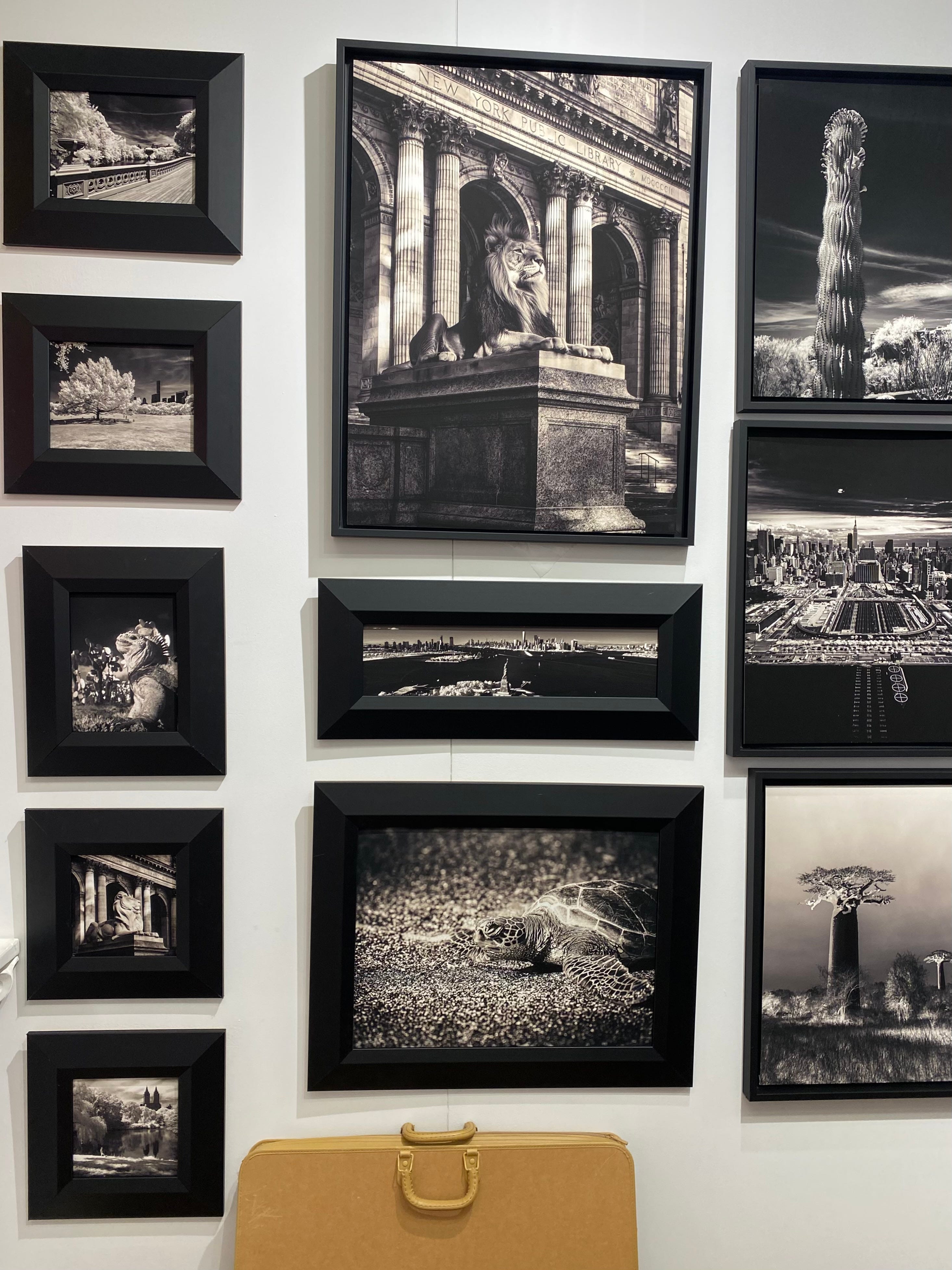
Considering the Affordable Art Fair showcases works by innumerable artists, I was dismayed over the paltry display of photography and textile works. The few pieces of photography that I did see were genuinely interesting such as a series of black-and-white night photographs of New York taken with an infrared camera (sadly, I do not have the information on the artist as some of the venues did not do an adequate job of displaying key identifiers - artist/name of work/medium/year).
My final qualm with the Affordable Art Fair is that the works seemed, in large part, to be issue-less. What I mean is that there were hardly any works that commented on, alluded to, criticized, or engaged with much of anything that is going on in the world in 2024. I do not mean that every single artist necessarily needs to engage with these sorts of ideas, but for an event that exhibits thousands of artworks by hundreds of artists, I find it hard to believe that current events and pressing topics were not at the fore. In the three hours spent at the fair, I did not see every single artwork, but a quick glance in this case suffices when factoring in crowds and the swift passage of a few hours. And within that short timeframe, these were the questions that came over me: where are the works commenting on the urgency of the global climate crisis? What about the horrific genocide in Palestine or the War in Ukraine? Healthcare, abortion rights, and bodily autonomy? Social justice activism? The upcoming election in November? Police brutality, the military industrial complex, and surveillance? Ah, perhaps this may be the reason - in an event that is largely driven by commercial galleries whose prime intent is to sell art, it would appear that these and other relevant topics would not be considered aesthetically pleasing or beautifying to the potential owner. Good grief!
It is precisely for these reasons that I felt offended as an Art Historian, as an Artist, and as an Art Lover.
And that is where I return to my earlier point about the differences between commercial galleries and public galleries. Commercial galleries focus first and foremost on making a profit. You do not need to immerse yourself in arts literature to learn about this. Go to a commercial gallery on 5th Avenue or along Central Park South and I guarantee it will be a few seconds before a staff member remarks with any of the following: “Prices are listed below”, “Please feel free to ask any questions about the cost”, “What are you looking for today?”, and the list goes on. This feels no different than going car shopping. Thankfully, the public galleries are the ones that put cultural rather than financial value center stage, and these are in much greater abundance - Pace, Gagosian, Allison Bradley Projects, Agora Gallery, Rosebud Contemporary, Cheim & Read, Art Gotham, Kasmin, David Zwirner, Friend Editions, and hundreds of other galleries. These are the places that operate as miniature museums in that they have multilayered functions: education, inspiration, community outreach, socio-cultural awareness, etc. Also, I never want to defer to absolutes as I cannot affirm that every gallery represented in the Affordable Art Fair was resorting to those kinds of negative actions, particularly since there were a few artists and works exhibited that were thought-provoking.
I will close my remarks by talking about an artist who was the genuine saving grace of the Affordable Art Fair: Rose Blake (English, b. 1987), daughter of the British Pop artist Sir Peter Blake (English, b. 1932). Much like her father’s associations with Pop Art, Rose Blake’s paintings and illustrations are reflective of the world around her, albeit the Art World rather than popular culture. I honestly cannot say that I have seen any artist since the mid-20th Century whose style retains so much of the visual language used in Pop Art but utilized toward completely different ends. Rose Blake’s works are a playful mixture of vibrant colors, flattened geometric planes, and simplified-yet-recognizable artworks from the Modern & Contemporary canon set in the spaces of museums and galleries. Themes of spectatorship, the variability of what “art” is, and how cultural centers have evolved are just a few exciting thoughts that I began to think about. But I also found great delight in seeing these images as a “Who’s Who?” of Modern & Contemporary Art: a gigantic bulbous sculpture by French feminist artist Niki de Saint Phalle, an Alexander Calder mobile suspended from the ceiling, the corner of a Piet Mondrian painting poking out of a corner, etc. Seeing Rose Blake’s work was an important and uplifting reminder that even in the midst of duplicity and profit-drivenness, there are still tremendous strides being made in Contemporary Art - be it in a fair (as is the case with Blake at this year’s Affordable Art Fair), a biennial, a museum, a gallery, or, the artists around us each and every day in our communities and social media channels (you know who you are, friends!).

It’s 5:30am and I usually need my first cup of hot brew to get it all together. But you had me at the start and I read this article as passionately as you wrote it - literally as if I were that young emerging, frail, wide eyed, ready to take the art world by storm emerging artist before I even started the coffee pot. So much to say, but you really said it all anyway. Thank you for captivating me and sparking my old passion for seeing and creating in our crazy, mixed up, beautiful world. Onward!!!
It’s too bad the Affordable Art Fair was not a better experience, as I’ve seen so many underrepresented and undervalued artists of quality in my travels whose works rarely gets the light of day in the big name fairs or galleries. As to the lack of topical subject matter, it struck me as ironic, because the premise of the fair is in itself topical if it’s premise is meant provide a market for artists (and dealers )who are underrepresented for economic reasons.